SHUTTERS

There is something charming about them...
and lately I've been seeing projects with shutters - both old and new

like cabinets made with them..


and using vintage shutters as wall art.

I thought I'd share a few of my finds here and see if they inspire you...
because I'm looking at shutters in a whole new way

(great patio table... but needs better legs)

plant holders...


cupboard doors

headboard(s)


accent table

shelves


inside window accents


wall art


garden screen

birdhouse

sofa table

extra large desk (needs glass on top)

jewelry organizer

instant door charm

bar

wall covering


bookshelf

bulletin board

wall accent

kitchen island
Who knew you could do so many things with shutters?
QUESTIONS FROM READERS:
Jason Barbiaux commented on your blog post
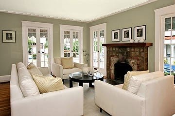
Our carpet is a very light brown. We are looking at furniture and one of the sectionals that we really like is pewter. What color can we paint the walls to tie those 2 together?
I love the combination of grays and beige/browns. I've included some photos so you can see its pleasing palette. Combine that with some fresh whites and creams and you have a great neutral combination to which nearly any accent color can be added.


I don't have a photo of your room, so can't recommend a color - but you can see that both grays and beige-grays look very good, as well as some taupes. Use these photos as guidelines. I like the idea of adding a lighter area rug to bring in a fresher feel, and white trim on the walls or windows always looks good with the gray tones.
Good Luck!
__________________________________________________________________
Good morning...I found your blog on-line (Exploring Wallcolor 2011) and have the same question another reader had regarding historic colors for a new Craftsman-style home. I really don't care for the strong greens, yellows and reds. Any suggestions in the gray, greige, soft green, soft blue gray tones? Sorry...no pic available...only drawings at this point.
Best,
Sharon K. Pardue
Sharon,
There are so many gorgeous colors in that palette - where to start? You have a new home in the craftsman style - it isn't the same as trying to restore a period home and remaining true to the colors of the period, but you can remain true to the craftsman aesthetic - nature. If you pay homage to the nature inspired feel, you have many colors you can choose from in a more current palette. You may want to have some wood tones, some natural stone, and the rest can be soft and soothing. Use colors that make you feel comfortable and ones you can live with for a long time. Here are some of my favorites from that palette...
GRAY GREENS

DRY SAGE - Benjamin Moore

AGANTHUS GREEN - Benjamin Moore

BRANDON BEIGE - Benjamin Moore

GRANT BEIGE & BENNINGTON GRAY - Benjamin Moore
GRAY HORSE - Benjamin Moore

GRAY WISP - Benjamin Moore

PLEASANT VALLEY BLUE - Benjamin Moore

ROCKPORT GRAY - Benjamin Moore

THUNDER - Benjamin Moore

COTTSWALD - Benjamin Moore
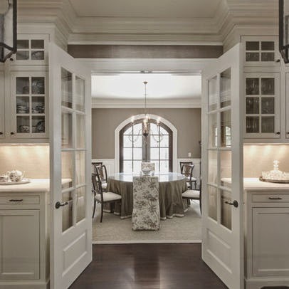
ASHLEY GRAY - Benjamin Moore

RAINWASHED - Sherwin Williams

SEA SALT - Sherwin Williams

MUSHROOM - Sherwin Williams

SVELTE SWEDE - Sherwin Williams
Good luck on your color choices!